Meet the Artist: Kate Miller
Share
One of our favourite things about working at For the Love of the North is the chance it gives us to meet some of the most talented people across the North. Today we wanted to talk a bit more about one of our favourite creatives, Kate Miller.
Kate is a printmaker from Newcastle who has created one of our most popular designs which we've printed onto cards and tea towels. Kate's artistic journey began at university where she would often find herself experimenting with printmaking and other techniques between lectures and seminars. Despite this, it was only after having children and a move to the North East that she decided to take it up full time.
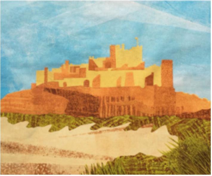
When creating her wonderful designs, Kate utilises a combination of methods that help to bring the scenes to life. Kate adopts techniques such as linocut, monotype and collage to produce the layers of depth that make her designs so special. When she is making her designs Kate begins with the linocut method to create a main outline whether that's of a castle, tree or lighthouse. Next Kate uses monotype printing to colour the sky or any large space of land be it grass or sand. The last stage of Kate's design process is arguably the most exciting- collage. Layers of paper, scraps and other organic materials are placed onto a printing plate and placed onto the design to emulate the grassy scapes and sandy dunes of Northumberland.
As natives to the North East, we're used to pretty rubbish weather! Even in April, we have become accustomed to sleet, snow and gales so, when the sun does fancy making an appearance, it fills us all with pure joy. That very same sense of elation is felt when you look at Kate's work. From vivid prints to detailed greetings cards to organic tea towels, Kate's work covers it all. Covering everything from Hadrian's Wall to Holy Island and everything in-between, Kate's designs have the power to transport you to all your favourite spots in the North East of England.
Kate uses different colour palettes to represent each of the individual regions within the North East. For instance, Kate tends to adopt tones of yellow and green to depict the beauty of rural Northumberland. Mustard tones are used to depict sun-soaked castles while sap green hues represent the regions glorious countryside. When Kate is designing a coastal area, be it Lindisfarne or St Mary's, she always uses blue and grey tones to emulate the crashing waves of the North Sea.
Kate Miller's printed designs are unlike any other - you can spot them a mile off- and they truly capture the beauty of our wonderful region in the most unique way. We're so lucky to have such an artist like Kate as part of our For the Love of the North family and we're so excited to see what wonderful designs she has planned for the future.